CSS Positions


CSS Positions are very important in CSS as they provides types of positioning methods used for an element like static, relative, fixed, absolute and many more. After setting the position property of an element we can use top, bottom, right and left to position them in the HTML.
Types of CSS Positioning are given below:-
- Static
- Fixed
- Sticky
- Relative
- Absolute
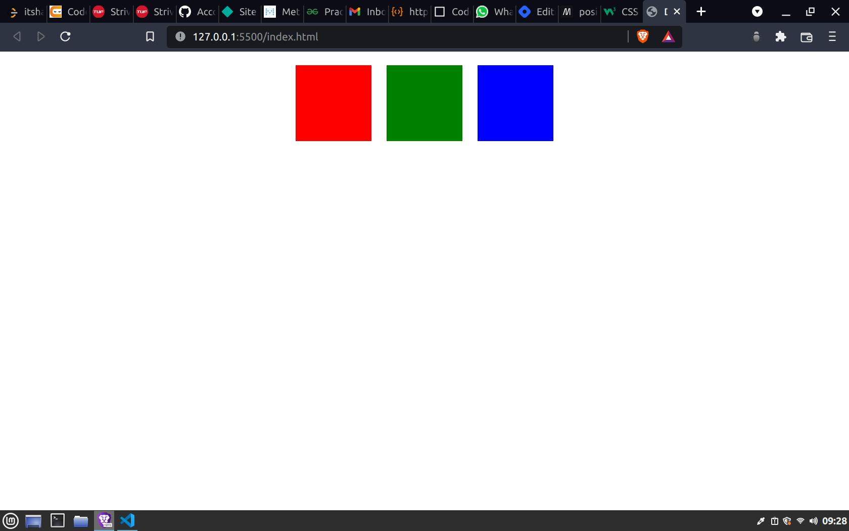
1) Static:- It is the default value of position. In this the element is positioned according to the normal flow of the html document. We cannot use the top, down, left or right property over it.
<style>
    .box{
        width: 100px;
        height: 100px;
        margin: 10px;
        position: static;
    }
</style>
Output
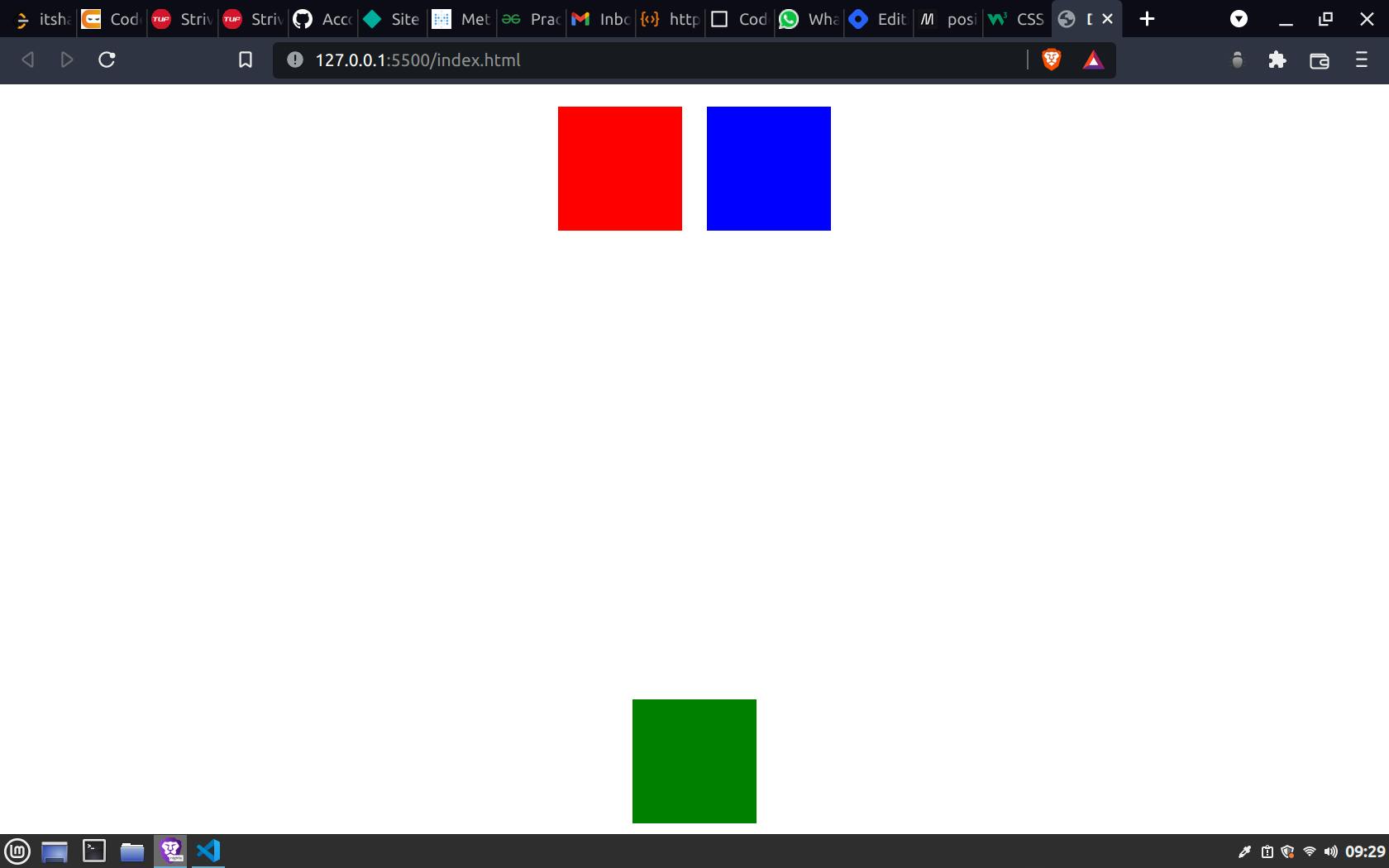
 2) Fixed:- It is used to fix an element to a particular position, even when we scroll the page the element will be there. This will also not leave any gap at it's original position where it used to be. Which means the gap will be filled by other elements as a normal flow of the document.
Sometimes we need a button which says customer support or something like this, then that icon or button should always be available at that particular position of page, no matter you are scrolling the page or just viewing it, it should be there always, this is a use case scenario of position fixed.
<style>
    .container{
        display: flex;
        justify-content: center;
        align-items: center;
    }
    .box{
        width: 100px;
        height: 100px;
        margin: 10px;
    }

    .box1{
        background-color: red;
    }

    .box2{
        background-color: green;
        position: fixed;
        bottom: 0;
        z-index: -1;
    }

    .box3{
        background-color: blue;
    }
</style>
<body>
    <div class="container">
        <div class="box box1"></div>
        <div class="box box2"></div>
        <div class="box box3"></div>
    </div>
</body>
Output
 3) Sticky:- It is based on the user's scroll position. In this positioning the element is fixed to a particular position like property fixed but only when the user scrolls the one full view port.
It is mainly used to create a navigation menu bar which is always there on top even when the user scroll the page, this is a use case scenario of position sticky.
.container{
        display: flex;
        justify-content: center;
        align-items: center;
        position: sticky;
    }
4) Relative:- This is one of the most used position options. If we set the position relative then the element can be moved to top, left, right, bottom from it's position where is was placed in the DOM by the HTML.
A blank space will be there after using the relative position at the original place of the element.
<style>
    .container{
        display: flex;
        justify-content: center;
        align-items: center;
    }
    .box{
        width: 100px;
        height: 100px;
        margin: 10px;
    }

    .box1{
        background-color: red;
    }

    .box2{
        background-color: green;
        position: relative;
        top: 40px;
        left: 50px;
    }

    .box3{
        background-color: blue;
    }
</style>
<body>
    <div class="container">
        <div class="box box1"></div>
        <div class="box box2"></div>
        <div class="box box3"></div>
    </div>
</body>
Output
 As in the output you can see that the element is moved from it's original position where it was placed by default and the space of it's previous position is still there as a blank white space.
5) Absolute:- It is also one of the most used position value which feels to be confusing to some people. People are confused about relative and absolute very often.
This positioning position an element according to it's parent not according to it's own position. An element is placed according to it's parent which can be a div or body or even main html, it depends upon where the element is already available.
Like relative the position absolute does not takes it's space, it simply move to it's parent position and the space is filled according to the DOM level, which means the next elements will take it's place.
<style>
    .container{
        border: 2px solid black;
        display: flex;
        justify-content: center;
        align-items: center;
    }
    .box{
        width: 100px;
        height: 100px;
        margin: 10px;
    }

    .box1{
        background-color: red;
    }

    .box2{
        background-color: green;
        position: absolute;
        top: 40px;
        left: 50px;
    }

    .box3{
        background-color: blue;
    }
</style>
<body>
    <div class="container">
        <div class="box box1"></div>
        <div class="box box2"></div>
        <div class="box box3"></div>
    </div>
</body>
Output
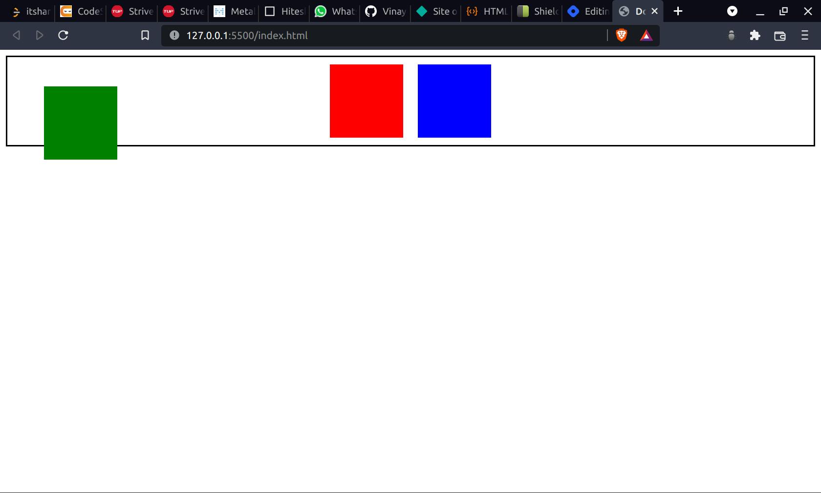
As you can see in the picture that the box 2 is positioned according to it's parent which is container in this case. Also it was a mid element but it's space is taken by the other element according to DOM structure, while in relative the space was left as it was.